Full Review of FastGrid Library's Capabilities

FastReport VCL Ultimate users have probably already noticed that the installer now includes two new options: FastEditors VCL and FastGrid VCL. A new demo has also been added to the DemoCenter: FastGrid VCL Demo.
FastGrid is a library for visualizing, editing, and structuring data in VCL and Lazarus. It consists of a table—a key element of visual programming. It allows for visual presentation of data and is widely used in applications for working with databases, tables, and lists. With FastGrid, you can create convenient and functional programs for data processing.
Built-in filtering, sorting, and data structuring functions significantly simplify development. They reduce development time by eliminating unnecessary coding and allowing you to focus on business logic.
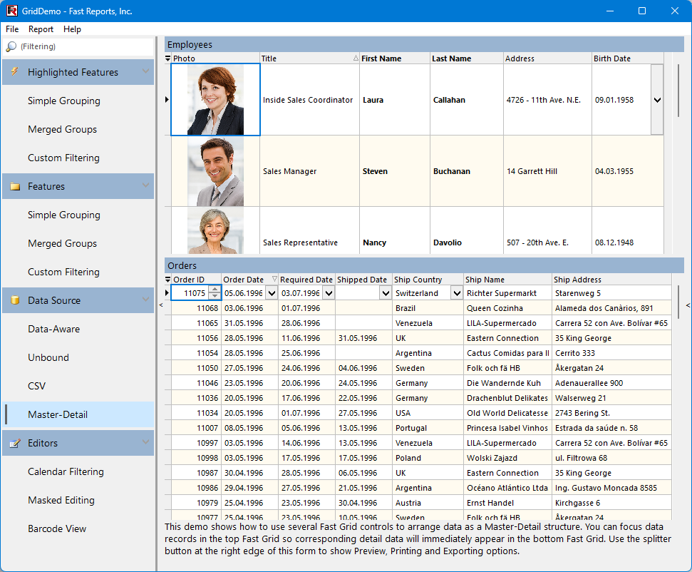
Key Features of FastGrid
- It works in two modes. The first mode is like a regular DBAware component (DB). We use the TDataSource component to bind to the data, and then work almost like with a DBGrid (only much more conveniently). The second is the Unbound mode, where the grid stores and manages data internally. For the end-user, these two modes are visually indistinguishable, and from a developer's perspective, the implementation differences are minimal.
- Convenience of data editing. Many people know how difficult it is to enter numeric data using TEdit. It requires a system that allows users to enter only numbers and ensures that the entered value falls within a specified range. FastGrid's current suite of built-in editors already covers most user requirements, and there are plans to significantly expand the library of available editors in the future.
- Manual input of large amounts of data. During development, special attention was paid to setting up keyboard shortcuts to speed up data entry.
- A built-in navigation element. You can position it on any side of the grid, customize the buttons, or hide it completely.
- Built-in data sorting and filtering capabilities. These capabilities are available both programmatically and in the user interface. You can sort by multiple columns simultaneously, in both ascending and descending order. Filtering is available at both the individual column and record levels.
- There are many ways to customize the grid's appearance. For example, with certain settings, you can make all fonts used in the grid bold, without changing the font size or other attributes!
- Multi-level grouping of grid rows by column values. Combinations of multiple columns are also supported for grouping.
- And, of course, integration with FastReport. Using the dedicated TfrGridReportBuilder component, you can print your grid with just one line of code, and you can export it to any format you need with the included export filters.
Building a Demo Application with FastGrid
Let's try creating a small data viewing application. This application will use the demo database included with FastReport VCL, namely demo.mdb.
Put a TADOConnection, TADOTable, and TDataSource on the form. Configure the TADOConnection to the demo database demo.mdb (if you have DemoCenter installed, this database is located in the folder "C:\Users\Public\Documents\Fast Reports\VCL\Feature Demos\FastReport VCL Demo\Data\". You can also find it in the sample directories included with FastReport. Link the ADOTable1 to the customer database table and open it. You're ready to create your first application with FastGrid.
The second step is to place the FastReport grid on the form. You can find it in the "FastControls VCL" tab in the Components panel. We actively use all the components in this tab, and you can see them when editing and viewing reports.
Now let's connect our grid to the data. Note that the grid is a complex component. The grid can contain one or more View elements that display the data. The grid can also contain a data navigator.
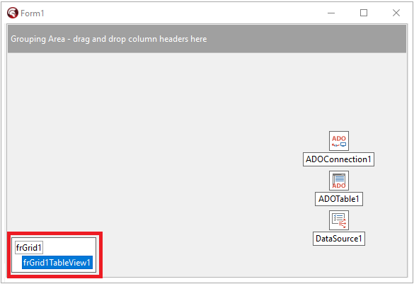
In the lower left corner of the grid, you can see the "legend." The legend shows the grid itself and the other components on it. Click on the frGridTableView1 element in the legend. The Object Inspector now displays the properties of the View on the grid. Now, find the DataController property in the Object Inspector and expand it. Next, let's set the value DataSource1 to DataController.DataSource. Now the current View is bound to the data.
How do we actually display the data now? In a standard DBGrid, data is shown automatically. In our case, however, you must first add the specific fields you wish to display. First, open the table associated with the grid. Next, right-click on the legend, select the row corresponding to your View, and choose "Add missing columns" from the context menu. As the name suggests, this option adds all fields from the linked DataSource to the current View that are not already present. Since we currently have no fields defined, all of them will be added at once. You should see a result similar to the image shown below. Alternatively, you could select the "Link to DataSource" menu item—this would immediately connect the grid and automatically create all fields from the data source. Other commands in this menu also allow you to remove all fields from the grid or add a single field for further manual configuration in the Object Inspector.
Now let's edit the resulting grid a little. We'll remove the Addr2, Zip, Fax, State, and TaxRate fields. To do this, simply right-click on the column header and select "Delete." If necessary, we can change the column widths directly in the designer with the mouse. Now let's add Data Navigator for the grid—we move on to the View properties and set OptionsView.ShowDataNavigator := True.
We would like to emphasize that the OptionsView property contains general parameters affecting the grid's appearance. You can configure the position and other parameters, including the data navigator buttons displayed, with the OptionsDataNavigator property. After doing this, we'll get the following result in the IDE editor:
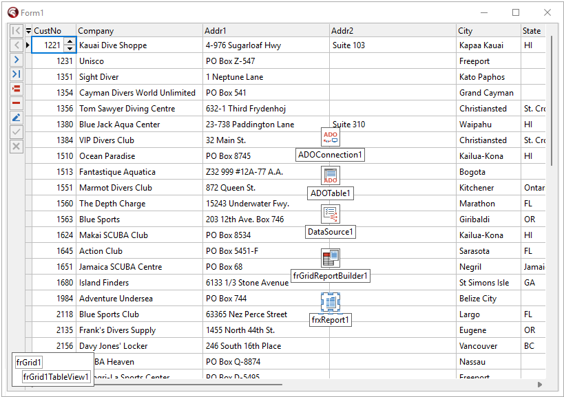
Let's briefly go over the rest of the View properties:
- The OptionsData property allows you to configure the permitted data operations.
- OptionsCustomization controls user permissions to do various actions, such as sorting and filtering data, as well as resizing or reordering (moving) grid columns.
- OptionsBehavior confirms some operations with data.
- DataController sets up data connection.
- OptionsView—various settings for the grid appearance.
- Properties with names starting with the Appearance… prefix primarily control the visual style of various grid elements and their inheritance from parent components. We will examine these properties in more detail in future articles.
Let's run the resulting application and see what an ordinary user can do with it.
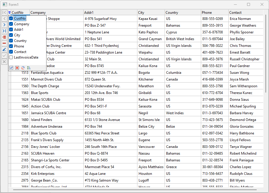
The user can do quite a lot. For example, clicking on a column header sorts the values. In the screenshot, we've sorted the grid by the Contact field.
If we hover over the column header, we'll notice that a Filter Mark icon appeared there. Clicking this icon will allow us to filter the data.
Any user can reorder or resize columns using the mouse, provided that you, as the developer, have enabled these permissions. FastGrid also allows for hiding unnecessary columns. To do this, left-click the upper-left corner of the grid and, in the popup window that appears, check or uncheck the names of the columns. The screenshot illustrates this column visibility management mode.
Note that the CustNo column has elements of the UpDown type. The grid automatically detected that the field type is this number, and selected the appropriate editor to work with the field.
If needed, you can manually select an editor for working with a field. To do this, select the desired column in the IDE designer. Then, in the Object Inspector, go to the column's "Properties" property and select the desired value from the drop-down list. After selecting an editor, "Properties" will become expandable, allowing you to configure its parameters.
There are currently about ten editors available, and their number is constantly growing. Grid editors are also available as separate components. Avoid using data type editors that are incompatible with your field type. We will cover working with grid editors in detail in another article. For now, note that you can programmatically specify an editor for a grid column using the editor's name.
We have successfully created a small application that displays a table—all without writing a single line of code! Now, let’s try adding some functionality to our application, such as selecting which table to view, printing, and exporting table data to CSV format.
Let's put the following controls on our form: frComboBox, 3 buttons, frSpinEdit and components TfrxReport, TfrGridReportBuilder and TfrxCSVExport. We'll use frComboBox to select the table to display. We'll set the frCombobox1.Properties.DropDownStyle := frddsFixedList in the Object Inspector and write the FormCreate handler:
procedure TForm1.FormCreate(Sender: TObject);
var I:Integer;
begin
 frCombobox1.Properties.Items.Clear;
 ADOConnection1.GetTableNames(frCombobox1.Properties.Items);
 I := frCombobox1.Properties.Items.IndexOf(ADOTable1.TableName);
 if I <> -1 then begin
 frCombobox1.ItemIndex := I;
 end;
end;
And OnClick handler for Button1:
procedure TForm1.Button1Click(Sender: TObject);
begin
 ADOTable1.Active := False;
 ADOTable1.TableName := frCombobox1.Text;
 ADOTable1.Active := True;
 frGrid1TableView1.Columns.Clear;
 frGrid1TableView1.Columns.RetrieveMissingColumns;
end;
Now, if we launch our application, frComboBox1 will be populated with all tables from our database, and the one currently specified in our ADOTable will be selected by default. Clicking Button1 will then display the contents of the selected table in the grid. Let’s try opening the 'biolife' table:
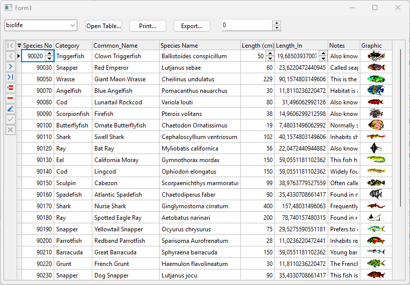
The grid automatically detected field types and can even display images stored in the database. However, the resulting images are small. Let's write the following handler for frSpinEdit1:
procedure TForm1.frSpinEdit1PropertiesChanged(Sender: TObject);
begin
 frGrid1TableView1.OptionsView.RowHeight := frSpinEdit1.Value;
end;
Now, when you enter a value in frSpinEdit1 and press Enter, we set the grid row height. Let's try printing the grid contents. To do this, we'll set the frGridReportBuilder1 component properties as follows:
Report:=frxReport1;
View:=frGridTableView1;
Options.BuildReportActionType:=braShowReport
Options.BuildReportActionType:=frxCVSExport1
And let's write our line in OnClick Button2 handler:
procedure TForm1.Button2Click(Sender: TObject);
begin
 frGridReportBuilder1.Build;
end;
Let's launch application, click on the Print button (Button2) and we get:
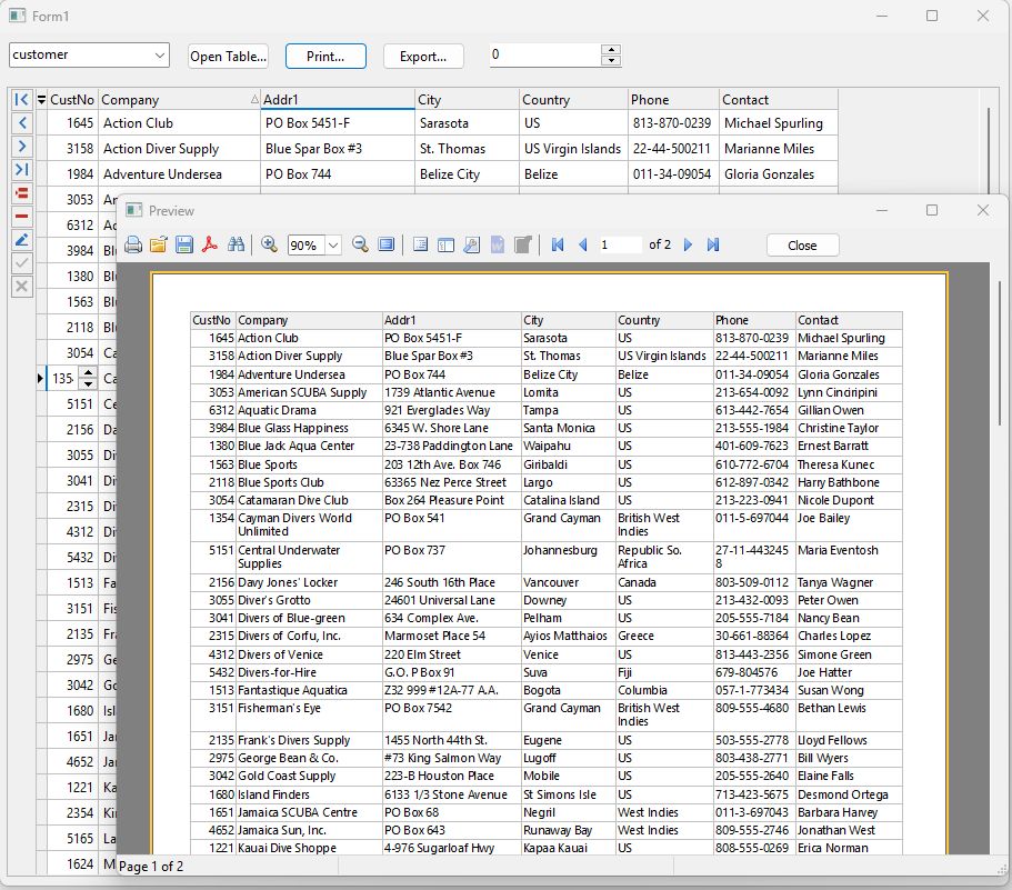
In this example, we sorted the grid by the "Company" field and hid some columns. However, the preview displays exactly the same data as in the grid.
Options.BuildReportActionType property of the TfrGridReportBuilder component determines what will be done with the current report after it is generated. There are three possible options:
- braPrepareReport simply prepares a report, and the programmer decides what to do with it next.
- braShowReport – shows a preview.
-
braExportReport – exports the prepared report to the pre- defined export filter in the
Options.DefaultExportproperty.
Let's write the following handler for Button3:
procedure TForm1.Button3Click(Sender: TObject);
begin
 TfrGridTableViewReportBuilderOptions(frGridReportBuilder1.Options).BuildReportActionType := braExportReport;
 frGridReportBuilder1.Build;
 TfrGridTableViewReportBuilderOptions(frGridReportBuilder1.Options).BuildReportActionType := braShowReport;
end;
Let's launch our application and try pressing Button3. We will see a dialog box for exporting to CSV, followed by a dialog box for saving the resulting file. If we open the resulting file, we'll find that its contents match the data in the grid.
A Brief Summary of the FastGrid Review Article
Thus, with a few mouse clicks and a dozen lines of code, we have created a rather useful utility that allows you to export from a connected database.
This example will work for Lazarus, including Linux. The only changes you'll need to make are the data access components and the methods for retrieving a list of tables from the linked database and activating the selected table. The grid works with any TDataSet descendant.
You can explore this demo example without even typing code in your IDE. Everything is included in the FastGrid demo suite called "DataAware."
As we can see, working with the TfrGrid component is quick and easy. In this article, we've briefly covered the main uses of this component. In future articles, we'll explore various aspects of grid use in more detail. If you're interested in any particular aspect of its use, let us know, and we'll do our best to cover the details more comprehensively. And don't put away the small project we built today—we’ll be needing it again soon!