With FastReport Business Graphics library you can visualize different hierarchical data, build business diagrams for further analysis and decision-making. All this can work directly in your application!
Features and Benefits Business Graphics .NET

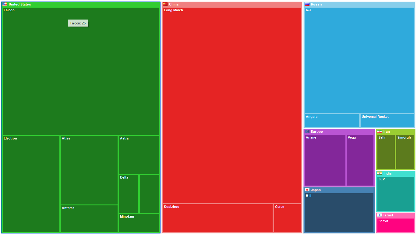
The Treemap chart
Is a way of visualizing hierarchical data in the form of rectangles whose area is proportional to the value of the displayed record. Within the rectangles of parent records are nested rectangles of child records. This tree chart is suitable for comparing several hierarchies at the same time.

The Bubble chart
Is a way of visualizing hierarchical data in the form of circles with the area proportional to the value of the displayed record. The circles of child records can be nested inside the circles of parent records. The arrangement of the circles is formed by using a packing program based on the Grokker algorithm, which was modified for a better display of hierarchical data. The Bubble diagram helps to compare several hierarchies that are simultaneously at the same hierarchy level.

The Sunburst chart
Is a sun-like chart with branching rays. The circle in the center is the root node, and the rays that move outward are the children. Each value on the chart occupies an area, the boundaries of which are defined by the start angle and the sweep angle. The larger the value you want to display on the chart, the larger the sweep angle. This chart is suitable for analyzing each level of the hierarchy.

The Icicle chart
Presents data based on the hierarchical clustering method. The Icicle chart is easier to read, showing which hierarchy objects belong to and which are children. The large rectangle at the top of the chart represents the root node, whose width depends on the sum of the child nodes. The child nodes are placed below the parent nodes. The chart can also have several drawing directions: down, up, left, and right. An icicle graph is a good way to visualize hierarchical data. The advantages are that it is easy to see the hierarchy, its size, and the level at which it is located. It's also great for examining data relationships.

The Gantt chart
Illustrates a work plan/schedule for a project. It consists of two parts: the left part has a list of tasks, and the right part has a timeline with bars that depict the work. The colors for the intervals are allocated according to the resources from the palette. This chart helps to solve one of the main tasks of business process planning and show the staff what to work on, what resources to apply in the process and at what speed to perform certain tasks. Using a Gantt chart makes it much easier to manage small projects.
Ultimate .NET
This set of components is not sold separately, but is included in the Ultimate solution, with which you can create your business projects on all modern platforms .NET, ASP.NET , Blazor, WASM, WPF, WinForms, Avalonia UI, Mono and others. The Ultimate data visualization tool will be complemented by OLAP cubes, source codes and other advanced features.
On which platforms is it supported?
Currently, work with WinForms and applications is supported .NET Framework 4.6.2 and higher.