Conditional data highlighting in FastCube .NET
One of the main tools for data analysis in OLAP programs is "Data Highlighting". This very tool allows you to quickly estimate the "situation", identify trends in deterioration or improvement.
In FastCube .NET, the data highlighting is represented in two types:
- Highlight all cells dependent on value. You can highlight all cells in a column or a row by using a rule that separates a set of values into ranges. Each range is highlighted with a separate color or icon. This type of selection helps to quickly evaluate the data by color, without going into figures.
For example, you set three ranges of values: less than 33, from 33 to 66, more than 66. All values that fall in the first range will be highlighted in red, in the second range - yellow, and in the third - in green. By focusing on the color, you can instantly estimate in what range values are located.
- Highlight cells matched condition. This type of highlighting allows you to highlight cells in a row or a column that fall under a specified condition. The difference from the previous type is that values that do not match the condition are not affected. For example, you want to evaluate who from the managers in your company exceeded the plan of 30 sales per month. You just set the Value> 30 condition and select the highlight color.
The first type of selection of cells in color has 4 types:
1) Two color scale;
2) Three color scale;
3) Bars;
4) Icon set.
The easiest way to explain how this works is by example.
As I wrote above, the rules apply to rows or columns. Therefore, if you plan to create a highlight rule for a parameter, so you should first select it.
Two color scale
From the name of this type it is clear that only two basic colors are used to highlight the data. Let's look at the slice of the cube on sales by managers:
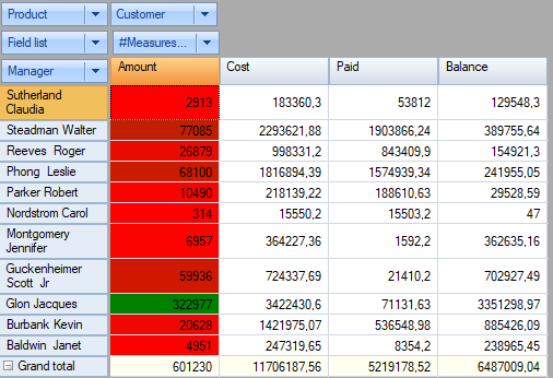
Here you can see two basic colors - red and green. The green color highlights the maximum value and close to it, and red - the minimum and close to it. The mean values have a different shade, depending on which extremum it is closer to.
So, how to set this rule? Click on the icon ![]() to call the data selection rules manager. Remember that you must first select a parameter.
to call the data selection rules manager. Remember that you must first select a parameter.
The rule manager looks like this:
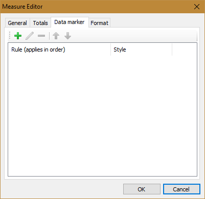
As you can see, this is the Data marker tab in the measure editor. Here we can add rules using the plus icon, edit using the pencil icon and delete using the minus icon. The arrows control the way the rules are applied. We add a new rule:
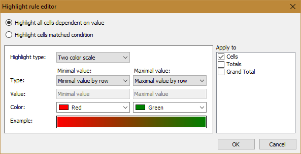
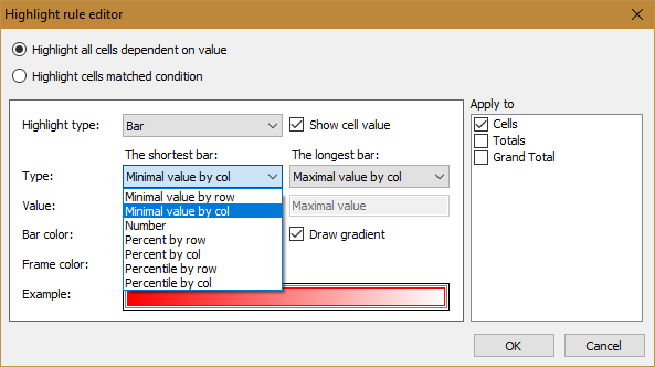
We select the first type of rule - highlight all cells dependent on value. By default, the two-color (two color scale) highlight type is selected. Below you can set the type of the value for the minimum and maximum values in the data set.
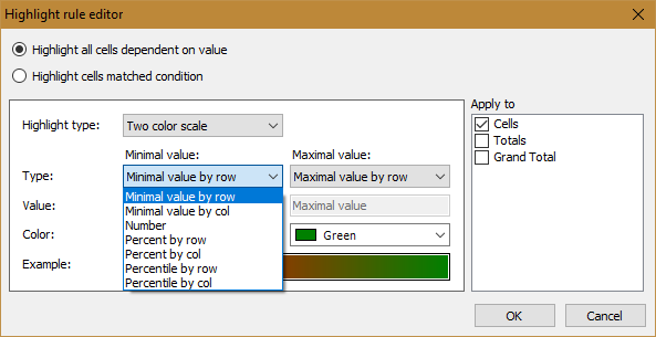
This can be a number, percentage or percentile. Percentile - the percentage of the set of values, which is divided into 100 equal parts. The percentile n is the value below which n percent of the data set is located.
Since we want to highlight the data in the column, we select the value of minimum value by col and maximal value by col for the second field.
For the Value parameter, you do not need to set the values in our case.
The last parameter is Color. Here you can set the color for the minimum and maximum values. Leave them by default red and green. Pay attention to the panel on the right. Now the Cells checkbox is marked there. This means that the rule will only apply to the values in the data set. You can also apply the rule to Totals and Grand Total. This makes the creation of the rule complete.
Three color scale
Let's look at the slice of the dynamics of population growth in countries (Dynamics of the Year).
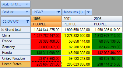
As you can see, the minimum values here are highlighted in red, and the maximum values are highlighted in green. The average value is yellow. In this example, all cells are selected with color, that is, the first type.
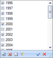
In the example shown, a tri-color scheme is used. But what if we have more than 3 columns? Let's open the filter for the YEAR measure and add a few more values:
As a result, we get such a colorful summary table:
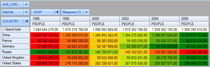
The values located between the minimum, average and maximum are colored in semitone by the gradient principle. So you can still focus on the color and its hues for evaluating the data.
To create a three-color data highlighting rule, open the rule manager using the button ![]() . Add a new rule:
. Add a new rule:
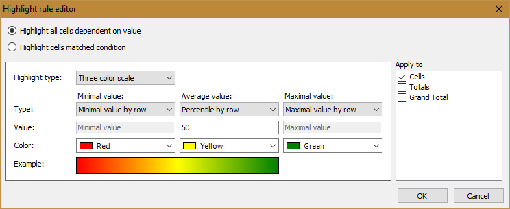
We select the first type of rule - Highlight all cells dependent on value. Highlight type - Three color scale. The value type, as in the previous example with a two-color scheme, can be represented by a numeric value, percent, or percentile. In the tricolor scheme, an intermediate field was added - Average value. Let's choose for it the type Percentile by row and set the value to 50. This means that data will be selected from the middle of the set.
Standard color settings: red for the lower limit, yellow for the average values and green for the upper limit. Leave the default settings.
Bar
Along with the color selection of cells in the data set, bars are often used. The bars clearly demonstrate the value, the larger the value - the wider the bar.
This type of highlighting, we will look at the example of the section Population in countries. The first measure People contains the count of people in countries. We add for this measure a rule with a highlight of the type Bar:
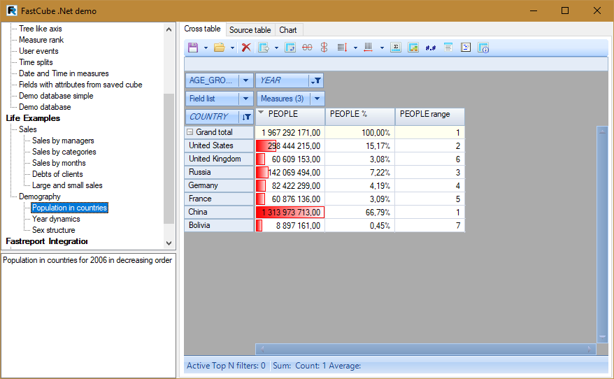
Now, without getting into the concrete values of the cells, we see that China is the most populous country on our list, and Bolivia has the lowest rate. This greatly simplifies the work of the analyst, when analyzing large amounts of data.
To create this rule, select the first column (People measure) and call the Data marker. Create a new rule:
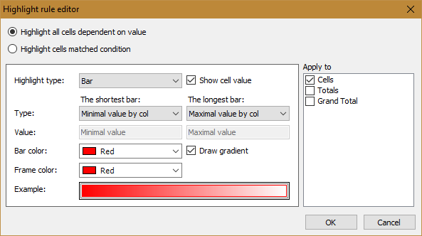
Rule type - Highlight all cells dependent on value.
Highlight type - Bar.
There is the "Show cell value" check box to the right of the highlight type, which enables or disables the display of a numerical value in cells.
Next, we need to specify values for two types of strips - short and long. The possible values for them are all the same as for the two-color highlight:
Color settings allow you to set the color of the strip and the border. There is the “Draw gradient” checkbox on the right, which creates a gradient of color from selected to white. If you disable it, the strip is filled in solid.
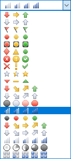
Icon set
Another type of highlight - icons. Instead of filling with a color or a strip, we'll see an icon - an arrow, a circle, a cross, or some other. The set of icons is big enough.
Icon sets are a symbiosis of the previous three types. There are colored arrows and circles, which are similar to highlighting data using color. Other icons are similar to stripes. They show a quantitative measure with the help of graphics.
Let’s consider this type of data highlighting using the example of a slice “Sales by month”.
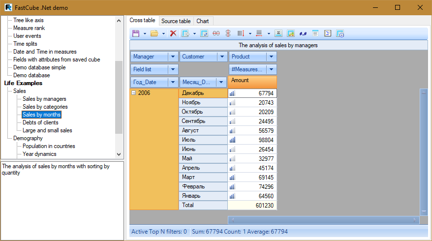
The selected set of icons allows you to show the count using four vertical sticks. The first association when you see these icons is the level of the cellular signal. Therefore, they look familiar and informative.
To create this rule, open the Data marker (rules manager) and add a new rule.
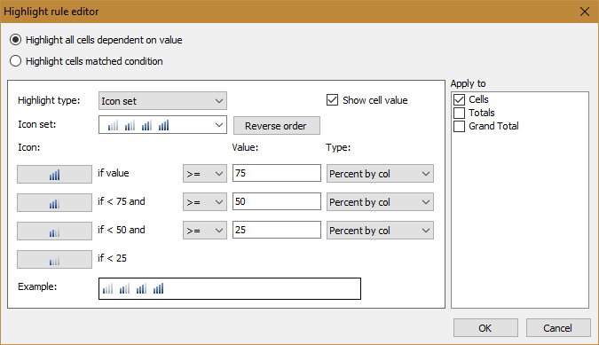
Rule type - Highlight all cells dependent on value.
Highlight type - Icon set.
Then, we select a set of icons. As you can see, the sets contain different number of icons: 3, 4, 5. This means that the data set will be divided into the same number of ranges.
The Reverse order button is located to the right of the icon set, which allows you to arrange the icons in reverse order.
Below, we need to specify the type and value for each range. This can be a number, percentage or percentile. Since, we create a rule for the column, then we select the type Percent by col, instead of the Percent by row, by default. Values are already filled with approximately equal shares. Let's leave them alone.
Highlighting of cells corresponding to condition
The second type of data selection rules provides for highlighting only those cells that correspond to the specified condition. Consider the example of a Simple Cube slice.
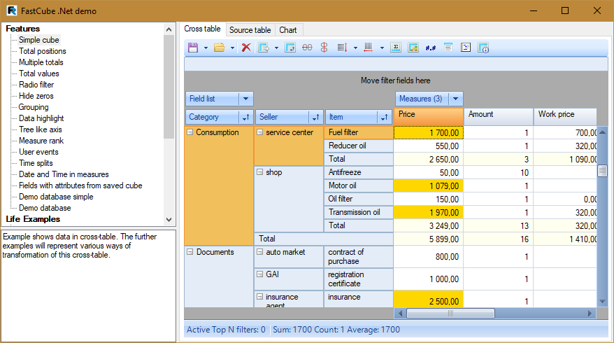
We have highlighted the price of yellow with a value of more than 1000. To add this rule, select the first column (measure Price) and open the data selection rules manager (Data marker). Create a new rule:
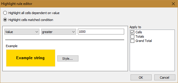
The rule type is Highlight cells matched condition.
In the first field, select the type of the value to be compared. It can be:
- Value;
- Text;
- Date;
- Empty;
- Not Empty.
Depending on the selected type, the set of conditions in the second field is changed.
For Value:
- greater;
- between;
- equal;
- not equal;
- less;
- greater or equal;
- less or equal.
For Text:
- contains;
- not contains;
- starts with;
- ends with.
For Date:
- greater;
- between;
- equal;
- not equal;
- less;
- greater or equal;
- less or equal.
For Empty and Not Empty conditions are absent.
The third field is for the reference expression, that is, with what we compare.
Below we set the style of the selected cell:
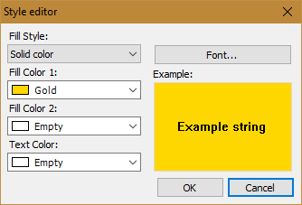
By default, the Solid color style is selected with a simple background fill in one color. But the set of styles cannot be called "poor":
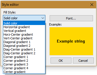
Selecting a gradient, you need to specify two colors.
Also, here you can change the font and its color.
Conclusion
In conclusion, I want to draw your attention to the fact that you can add as many rules as you like to highlight the color, and some of them will overlap. To set the priority, you need to move the rules in the rule manager using the arrow icons. The higher the priority, the higher the rule in the list should be.