How to build daily graphics from csv files
Suppose you keep a record of employee sales in an Excel file. Would you like to see sales results for the month in the form of a graph. So it's faster and easier to assess the efficiency of the employee. It would be nice to see the difference in terms with the previous day. You need this report every morning. FastReport Desktop comes to the rescue. With the help of it we will create a report with a nice chart and create a task in the scheduler for the daily sending of the report to you by the email.
Let's determine the data source. This will be a csv file, for example, with the following content:
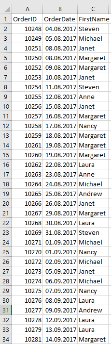
We have three columns: the order number, the order date, the seller's surname.
Suppose this file is updated daily with new data. Then every morning the chief will receive a report with a schedule of sales for employees.
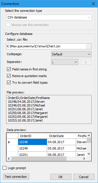
Let's create a report. Add a new data source - CSV file.
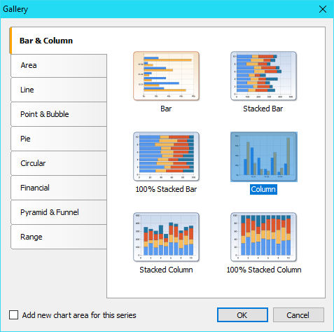
We place the Chart object on the report page. No matter in what band. Let it be the Data band.
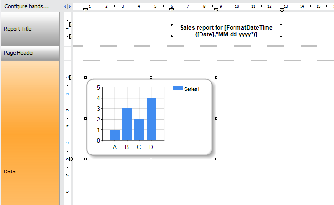
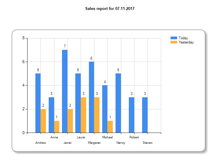
As you noted, the report header contains the date:
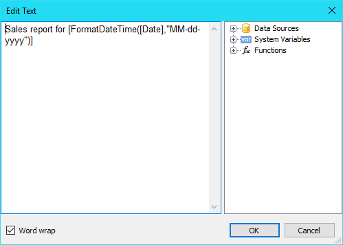
We used the system variable [Date], and to display the date without time, we used the function FormatDateTime.
We proceed to the diagram. Double-click on it:
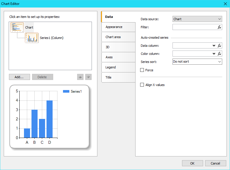
At the top right, you need to select the data source for the chart, which we call the Chart. The chart consists of series, which actually represent diagrams. We already have one added series - Series 1. Click on it.
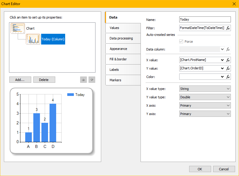
On the "Data" tab we need to determine which fields from the source we will display. For the value of X, select the FirstName field. For the value of Y, the OrderID.
There is the "Filter" field above. Let's add here such a complex expression in it:
FormatDateTime(ToDateTime([Chart.OrderDate]), "MMYYYY") ==FormatDateTime([Date], "MMYYYY")
Here we get the month and year from the OrderDate field and compare it with the current month and year. Thus, we filter the actual data for the current year and month.
Let's change the name of the series to "Today":
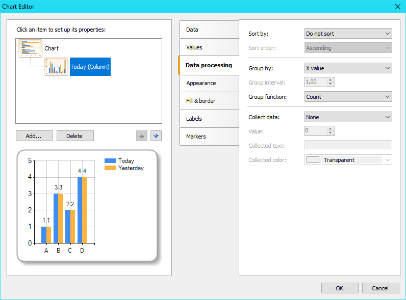
Go to the "Data Processing" tab. Here we will enable the grouping of data by " X Value", and the function - Count:
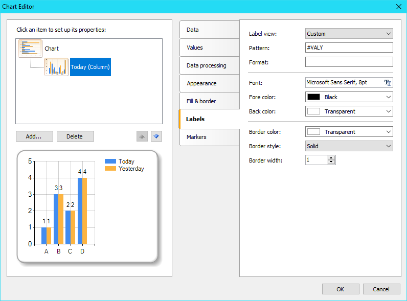
On the "Labels" tab, select "Pattern:" - VALY
Now let's add one more series to the chart and call it "Yesterday":
We adjust it with the same parameters as the first series, with only one change. In the filter there will be one more condition:
(FormatDateTime(ToDateTime([Chart.OrderDate]), "MMYYYY") ==FormatDateTime([Date], "MMYYYY"))&&(ToDateTime([Chart.OrderDate])<AddDays([Date],-1))
Now we check that the data was on the date less than the current one day. This will enable us to compare sales for today and yesterday.
So, the report is ready. Let's create a configuration that will send the report by mail. Launch the Configurator application from the FastReport Desktop package.
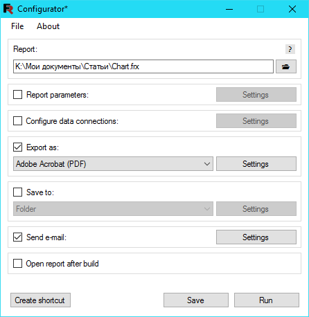
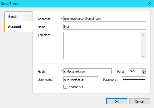
Select the report file, mark the option "Export as" and select the PDF format. Now enable the "Send e-mail" option. In this case, you will be offered to set up sending of messages:
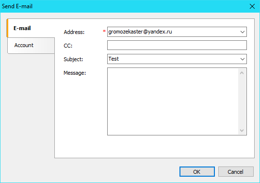
And
Save the configuration file using the Save button.
Run the Scheduler application from the FastReport Desktop package.
Create a task and edit the parameters:
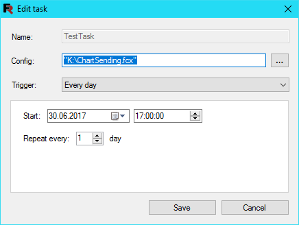
Select the configuration file, the trigger - Every day, the start date and time. Periodicity of recurrence 1 day. Now every day at 17.00 the boss will receive a letter by the e-mail box.
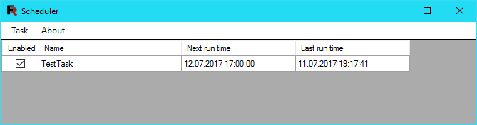
Let's start the task for the sake of interest, without waiting for the execution time. Do the right click on the task and select Run task now:
And we receive a letter with a nested pdf file that contains our chart:
As you can see, for some 10-15 minutes we have created a useful tool for control. You can also automate the sending of other charts and diagrams.