Example 2: The dynamics of population growth
This example is based on the grid created above.
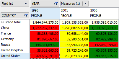
To achieve our objective we need to move the "Year" dimension from the filters region to the columns region, before the measures field, and add the values '1996' and '2001' to the years filter. As a result, the grid will show the population size in 5-year intervals between 1996 and 2006. Further, we can filter the country dimension to show just six countries: China, France, Germany, Russia, United Kingdom and the USA:
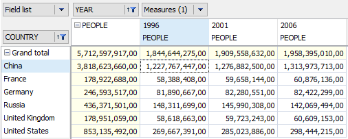
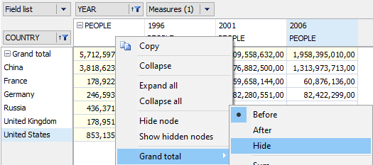
Now the first column shows the sum of the other columns and does not make any sense in this context, so we can hide the column. This is done through the context menu for the People item - 'Grand total->Hide':
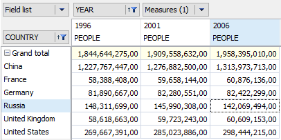
The final grid looks like this:
This grid is useful for presenting the raw demographic data, but a far greater impact can be made when presented as a chart:
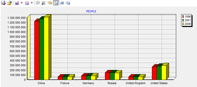
The chart clearly shows the relative sizes of the populations.
But to reveal which populations are increasing in size and which are falling, the grid data can be emphasized using the highlight tools: