Collapsing/Expanding elements
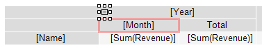
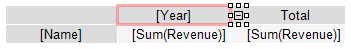
You can interactively manage the visibility of individual header elements using a special button of type MatrixCollapseButton. The button is inserted into the header element and manages the visibility of other elements. The picture below shows the button and its managed element (marked with a red frame when the button is selected):
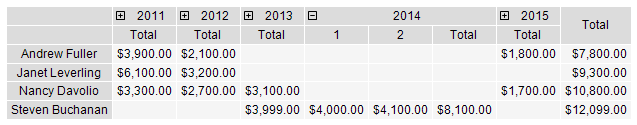
When you click on a button in the preview window, related elements are hidden or shown. In this case, the report is rebuilt:
Adding a button
You can add a button to a header element using the context menu. Select the item, right-click and select Collapse button. The button is added to the left side of the element.
When a button is added, the element's Property
Padding.Leftchanges so that the button does not overlap the text.
Button customization
When a button is added, FastReport automatically configures the link between the button and its managed element. In some cases, you may need to configure the link manually. To do this, open the editor of the element that should be dependent on the button, and specify the name of the button on the "Visibility/Visibility is toggled by" tab.
The button can manage several elements at the same time.
The button can be placed above the managed element:
or at the same level with it:
The initial state of the controlled element — its visibility — is set in the element editor on the "Visibility/Visible" tab.
Deleting a button
You can delete a button in two ways:
- select the button and press the Delete key;
- uncheck the "Collapse button" in the context menu of the element.
Moving a button
By default, the button has Property Dock = Left. This means that it is docked to the left edge of the element. Set Property Dock = None in the "Properties" window to move the button to a new place.
You can also use the Property
Anchorof a button to anchor it to a specific location of an element.
Customizing the appearance of the button
Using the "Border" toolbar, you can customize the button icon: frame color and style, background color. In addition, you can set the following properties of the button in the Properties window:
| Property | Default value | Description |
|---|---|---|
| Cursor | Hand | Mouse cursor shape. |
| Exclusive | False | If true, then only one element can be expanded. |
| Exportable | False | If true, the button will be displayed when exporting the report. |
| Printable | False | If true, the button will be displayed when printing a report. |
| ShowCollapseExpandMenu | False | Determines whether a menu with "Collapse/Expand All" items should be shown when the right mouse button is pressed on this button. |
| Symbol | PlusMinus | The symbol displayed inside the button. |
| SymbolSize | 5 | Button Symbol Size. |