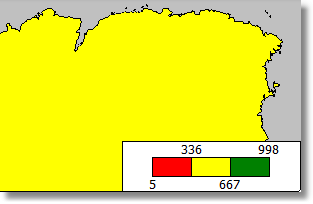
After you have finished connecting a layer to its data, the next question is - how to display analytical data (for example the sales volumes in various countries)? The easiest way is to set up labels displaying a country name and its sales (see "Setting up label display"). More visual impact can be achieved by painting each country with a color, dependent on its sales volume. For example, low sales as red, mid sales as yellow and high sales as green. This is done by setting up the color scale on the "Color scale" tab:
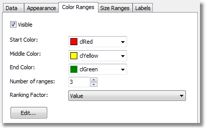
The color scale consists of several ranges. Each range has the following properties: min value, max value and color. You can use as many ranges as you need. To set up the color scale set the number of ranges first and then the properties for each range.
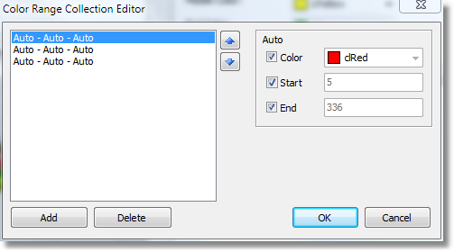
By default all range properties are set to "Auto", meaning FastReport calculates the minimum and maximum values for each range automatically. The auto color is chosen from three presets ("Start color", "Middle color", "End color"). The "Auto" mode may be suitable in most cases.
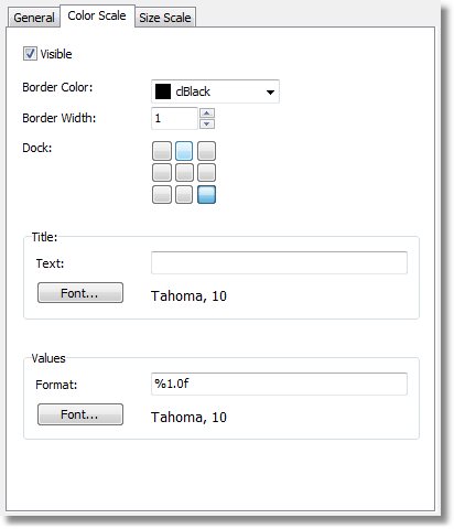
When a color scale is set up, an indicator control is displayed in the bottom part of the "Map" object:
To set the appearance and position of the indicator, select the "Map" element in the layers tree control and switch to the "Color scale" tab: