FastReport Business Graphics .NET 2022.1
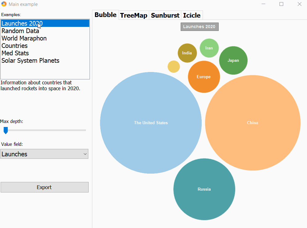
The new version of the FastReport Business Graphics library has the ability to build interactive hierarchical Bubble Charts.
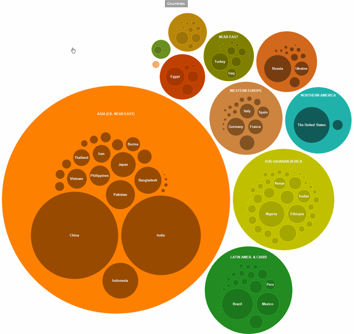
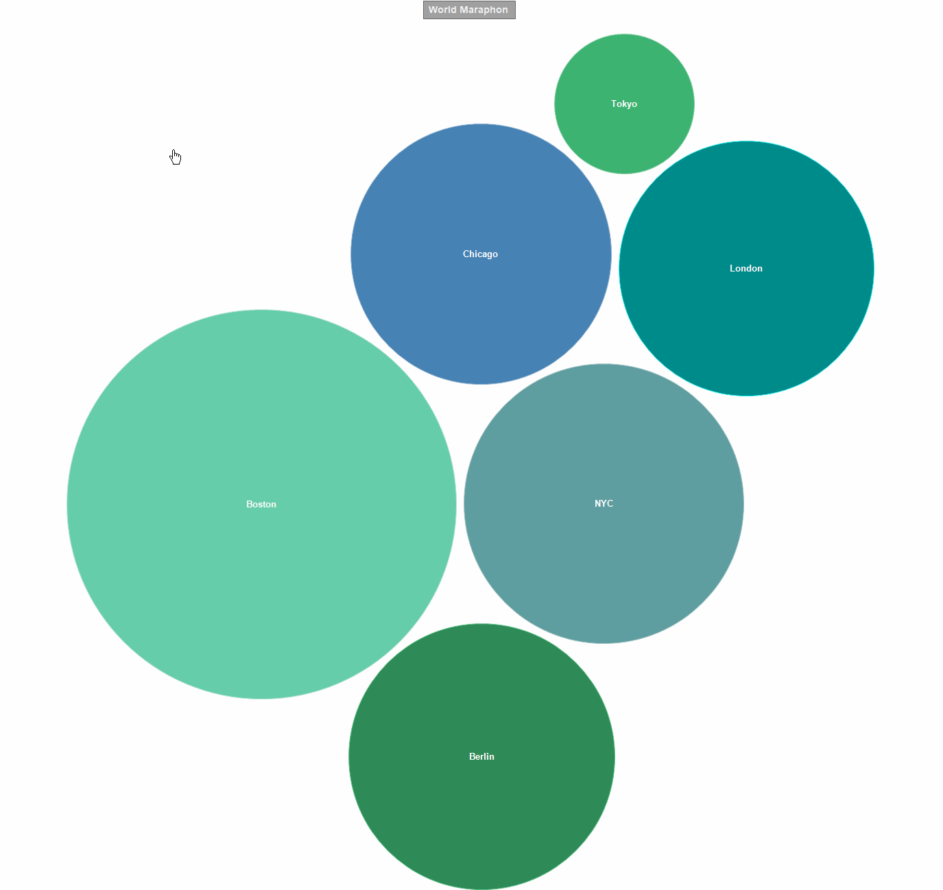
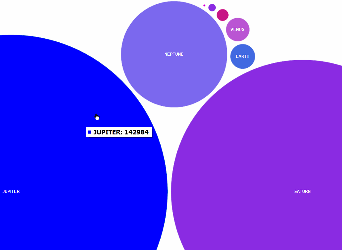
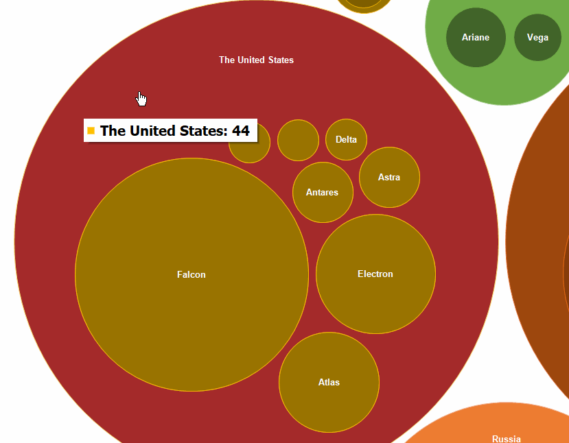
The Bubble chart helps to visualize hierarchical data as circles that have the area proportional to the value of the displayed record. Inside the circles of parent records, the circles of child records can be nested. The arrangement of the circles is formed using a packing algorithm based on the Grokker algorithm, modified for better display of hierarchical data. The general principle of the chart is largely similar to the TreeMap chart.
The depth of visualization of hierarchical data can be easily adjusted.
The appearance of the chart can be changed both from the code and directly in the chart style editor.
The library also contains predefined color palettes that can be used to form the desired color design for charts.
In addition, we have improved the demo application - it became more graphic and convenient.
The bugs were also fixed and the product documentation was updated.
Full list of changes:
+ added Bubble chart;
- bugfixes;
* improved MainDemo (interface, new dataset with Planets);
* updated documentation.